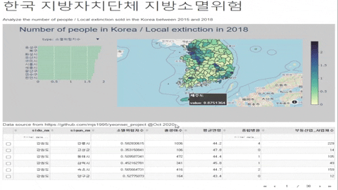
지도 시각화와 프로젝트 결과물을 토대로 한국지방소멸위험 대시보드를 제작하려고 합니다.
korea-dashboard.herokuapp.com/
(대시 보드 로딩하는데 시간이 조금 소요됩니다.)
대시보드 개발 을 위해 다음 도구, 기술 및 플랫폼을 사용할 것입니다.
- Python IDE
- Github : 소스 코드 버전 제어 및 저장소
- Heroku : 대시 보드 애플리케이션 배포를 위한 클라우드 플랫폼
필요한 패키지
dash 앱을 불러옵니다. 웹 프레임 워크에 익숙하지 않고 웹 개발 배경이 없지만 w3schools사이트에서 웹에 관한 정보를 얻었습니다.
dash-html-components - 애플리케이션에서 직접 html 기능 및 구성 요소를 구현하게 해 줍니다.
dash_core_components - 대화형 사용자 인터페이스를 쉽게 디자인할 수 있도록 그래프, 탭, 슬라이더, 입력 등 다양한 구성 요소가 존재합니다.
import pandas as pd
import json
import plotly.graph_objects as go
import dash
import dash_table
import dash_core_components as dcc
import dash_html_components as html
데이터 전처리
데이터를 불러 들어와서 geojson 파일을 지도 시각화하기 위해 전처리 작업을 해줍니다.
df = pd.read_csv('2018년소멸위험지수.csv', encoding='cp949')
df['sigun_code'] = df['sigun_code'].astype(str)

new_df = df[['sido_nm', 'sigun_nm', '소멸위험지수', '출생아수', '평균연령', '종합병원', '부동산업_사업체수']]

state_geo = 'map (7).zip.geojson'
state_geo1 = json.load(open(state_geo, encoding='utf-8'))
for idx, sigun_dict in enumerate(state_geo1['features']):
    sigun_id = sigun_dict['properties']['merged']
    sigun_nmm = df.loc[(df.sigun_code == sigun_id), 'sigun_nm'].iloc[0]
    risk = df.loc[(df.sigun_code == sigun_id), '총인구_여자(명)'].iloc[0]
    people = df.loc[(df.sigun_code == sigun_id), '총인구_65세이상(명)'].iloc[0]
    people_w = df.loc[(df.sigun_code == sigun_id), '소멸위험지수'].iloc[0]
    txt = f'<b><h4>{sigun_nmm}</h4></b>총인구_여자(명) :{risk:.2f}<br>총인구_65세이상(명) : {people}<br>소멸위험지수 : {people_w}'

    state_geo1['features'][idx]['properties']['tooltip1'] = txt
    state_geo1['features'][idx]['properties']['risk'] = people_w
지도의 색 범위를 지정해준 다음에 대시보드의 레이어 중 하나인 지도에 대한 전처리 과정입니다.
suburbs = df['sigun_nm'].str.title().tolist()

color_deep = [[0.0, 'rgb(253, 253, 204)'],
              [0.1, 'rgb(201, 235, 177)'],
              [0.2, 'rgb(145, 216, 163)'],
              [0.3, 'rgb(102, 194, 163)'],
              [0.4, 'rgb(81, 168, 162)'],
              [0.5, 'rgb(72, 141, 157)'],
              [0.6, 'rgb(64, 117, 152)'],
              [0.7, 'rgb(61, 90, 146)'],
              [0.8, 'rgb(65, 64, 123)'],
              [0.9, 'rgb(55, 44, 80)'],
              [1.0, 'rgb(39, 26, 44)']]

Types = ['소멸위험지수', '출생아수', '평균연령', '종합병원', '부동산업_사업체수']

trace1 = []

for Type in Types:
    trace1.append(go.Choroplethmapbox(
        geojson=state_geo1,
        locations=df['sigun_code'].tolist(),
        z=df[Type].tolist(),
        text=suburbs,
        featureidkey='properties.merged',
        colorscale=color_deep,
        colorbar=dict(thickness=20, ticklen=3),
        zmin=0,
        zmax=df[Type].max() + 0.5,
        visible=False,
        subplot='mapbox1',
        hovertemplate="<b>%{text}</b><br><br>" +
                      "value: %{z}<br>" +
                      "<extra></extra>"))

trace1[0]['visible'] = True
대시보드의 레이어중 하나인 Bar plot에 관한 전처리입니다.
trace2 = []

for Type in Types:
    trace2.append(go.Bar(
        x=df.sort_values([Type], ascending=False).head(10)[Type],
        y=df.sort_values([Type], ascending=False).head(10)['sigun_nm'].str.title().tolist(),
        xaxis='x2',
        yaxis='y2',
        marker=dict(
            color='rgba(91, 207, 135, 0.3)',
            line=dict(
                color='rgba(91, 207, 135, 2.0)',
                width=0.5),
        ),
        visible=False,
        name='Top 10 sigun with the highest {} value'.format(Type),
        orientation='h',
    ))

trace2[0]['visible'] = True
그래프 하나하나 특징에 대해 처리해 줍니다.
latitude = 35.565
longitude = 127.986

layout = go.Layout(
    title={'text': 'Number of people in Korea / Local extinction in 2018',
           'font': {'size': 28,
                    'family': 'Arial'}},
    autosize=True,

    mapbox1=dict(
        domain={'x': [0.3, 1], 'y': [0, 1]},
        center=dict(lat=latitude, lon=longitude),
        style="open-street-map",
        # accesstoken = mapbox_accesstoken,
        zoom=5),

    xaxis2={
        'zeroline': False,
        "showline": False,
        "showticklabels": True,
        'showgrid': True,
        'domain': [0, 0.25],
        'side': 'left',
        'anchor': 'x2',
    },
    yaxis2={
        'domain': [0.4, 0.9],
        'anchor': 'y2',
        'autorange': 'reversed',
    },
    margin=dict(l=100, r=20, t=70, b=70),
    paper_bgcolor='rgb(204, 204, 204)',
    plot_bgcolor='rgb(204, 204, 204)',
)
Types = ['소멸위험지수', '출생아수', '평균연령', '종합병원', '부동산업_사업체수']
layout.update(updatemenus=list([
    dict(x=0,
         y=1,
         xanchor='left',
         yanchor='middle',
         buttons=list([
             dict(
                 args=['visible', [True, False, False, False, False]],
                 label='type: 소멸위험지수',
                 method='restyle'
             ),
             dict(
                 args=['visible', [False, True, False, False, False]],
                 label='type: 출생아수',
                 method='restyle'
             ),
             dict(
                 args=['visible', [False, False, True, False, False]],
                 label='type: 평균연령',
                 method='restyle'
             ),
             dict(
                 args=['visible', [False, False, False, True, False]],
                 label='type: 종합병원',
                 method='restyle'
             ),
             dict(
                 args=['visible', [False, False, False, False, True]],
                 label='type: 부동산업_사업체수',
                 method='restyle'
             )
         ]),
         )]))

fig = go.Figure(data=trace2 + trace1, layout=layout)
대시 앱에서 웹 사이트 codepen.io의 외부 스타일 시트를 참고하였고 app과 server를 지정해줍니다.
external_stylesheets = ['https://codepen.io/chriddyp/pen/bWLwgP.css']

app = dash.Dash(__name__, external_stylesheets=external_stylesheets)
server = app.server
app.title = "한국 지방소멸"
앱의 주요 레이아웃 부분과 Dash의 핵심 구성 요소를 이용하여 대시보드를 구성하였고 대시 테이블 또한 지정해주었습니다.
app.layout = html.Div([
    html.Div(children=[
        html.H1(children='한국 지방자치단체 지방소멸위험',
                style={"fontSize": "48px"},
                className="header-title"
                ),
        html.P(
            children="Analyze the "
                     " number of people / Local extinction sold in the Korea"
                     " between 2015 and 2018",
            className="header-description"
        ),

        dcc.Graph(
            id='example-graph-1',
            figure=fig
        ),

        html.Div(children='''
            Data source from https://github.com/project @Oct 2020
        ''')]),

    html.Div([
        dash_table.DataTable(
            id='datatable_id',
            data=new_df.to_dict('records'),
            columns=[
                {"name": i, "id": i, "deletable": False, "selectable": False} for i in new_df.columns
            ],
            editable=False,
            filter_action="native",
            sort_action="native",
            sort_mode="multi",
            row_selectable="multi",
            row_deletable=False,
            selected_rows=[],
            page_action="native",
            page_current=0,
            page_size=6,

            style_cell_conditional=[
                {
                    'if': {'column_id': c},
                    'textAlign': 'left'
                } for c in ['Date', 'Region']
            ],
            style_data_conditional=[
                {
                    'if': {'row_index': 'odd'},
                    'backgroundColor': 'rgb(248, 248, 248)'
                }
            ],
            style_header={
                'backgroundColor': 'rgb(230, 230, 230)',
                'fontWeight': 'bold'
            },
        ),
    ],
        className='row'),

])
또한 대시 콜백을 이용하여 대화형 대시보드를 구성할 수 있습니다.
@app.callback(
    Output('graph','figure'),
    [Input('dropdown', 'value')]
)
앱을 실현하고 웹 브라우저를 자동으로 새로 고집합니다.
if __name__ == '__main__':
    app.run_server()
만든 대시보드를 heroku를 이용해서 웹사이트로 구현해보겠습니다.
깃허브
Heroku를 이용하기 전에 깃허브 저장소에 다음과 같은 형태가 되어있어야 합니다
apps
├── ...
├── Dash_korea # app project
│ ├── .gitignore # Backup File, Log File
│ ├── data # data(2018소멸위험지수.csv / map (7).zip.geojson)
│ ├── app.py # dash application
│ ├── Procfile # used for heroku deployment
│ ├── requirements.txt # project dependecies
│ └── ... └── ...
I. gitignore
venv
*.pyc
.DS_Store
.env
venv*
.pyc
.DS_Store
.env
II. app.py
대시보드 구현한 코드가 있는 app.py
import dash
app = dash.Dash(__name__)
대시보드 구현한 코드가 있는 app.py
import dash
app = dash.Dash(__name__)III. Procfile
web: gunicorn app:server
web: gunicorn app:serverIV. requirements.txt - terminal에서 pip freeze > requirements.txt를 입력하면 됩니다.
Brotli==1.0.7
click==7.1.2
dash==1.12.0
dash-core-components==1.10.0
dash-html-components==1.0.3
dash-renderer==1.4.1
dash-table==4.7.0
Flask==1.1.2
Flask-Compress==1.5.0
future==0.18.2
gunicorn==20.0.4
itsdangerous==1.1.0
Jinja2==2.11.2
MarkupSafe==1.1.1
numpy==1.18.1
pandas==1.0.0
plotly==4.8.0
python-dateutil==2.8.1
pytz==2020.1
retrying==1.3.3
six==1.15.0
Werkzeug==1.0.1
Brotli==1.0.7
click==7.1.2
dash==1.12.0
dash-core-components==1.10.0
dash-html-components==1.0.3
dash-renderer==1.4.1
dash-table==4.7.0
Flask==1.1.2
Flask-Compress==1.5.0
future==0.18.2
gunicorn==20.0.4
itsdangerous==1.1.0
Jinja2==2.11.2
MarkupSafe==1.1.1
numpy==1.18.1
pandas==1.0.0
plotly==4.8.0
python-dateutil==2.8.1
pytz==2020.1
retrying==1.3.3
six==1.15.0
Werkzeug==1.0.1HEROKU
Heroku
dashboard.heroku.com
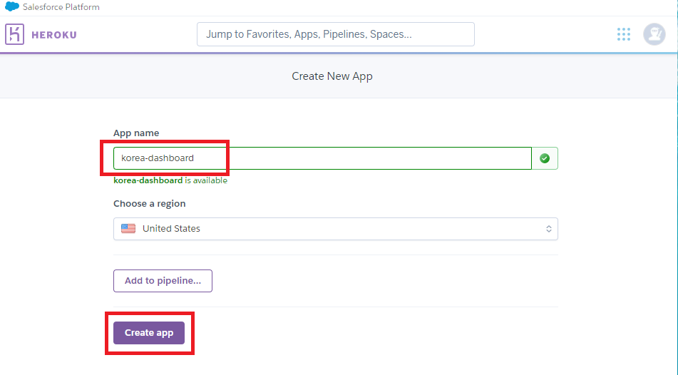
Heroku 사이트에서 회원가입을 한 뒤에 Create new app을 클릭해줍니다.

App name을 지정해준 다음에 create app을 클릭해줍니다
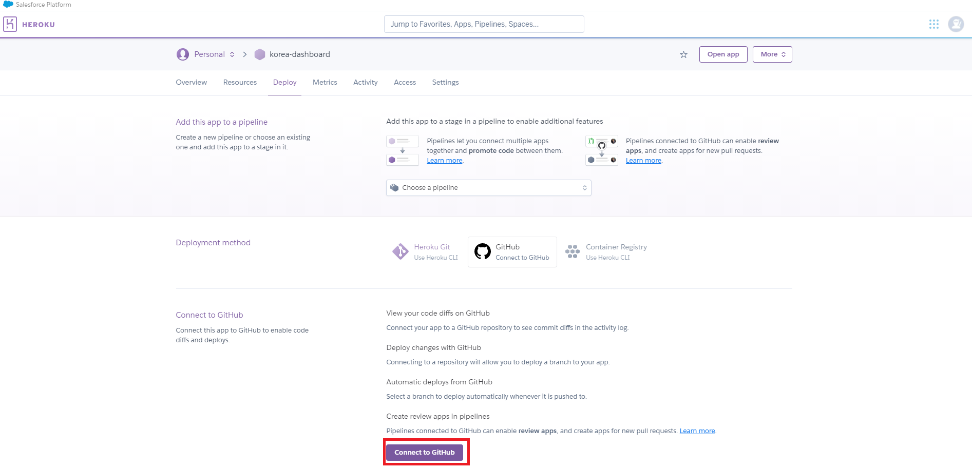
github와 연동을 하기 위해서 github를 클릭하고 연결해줍니다.
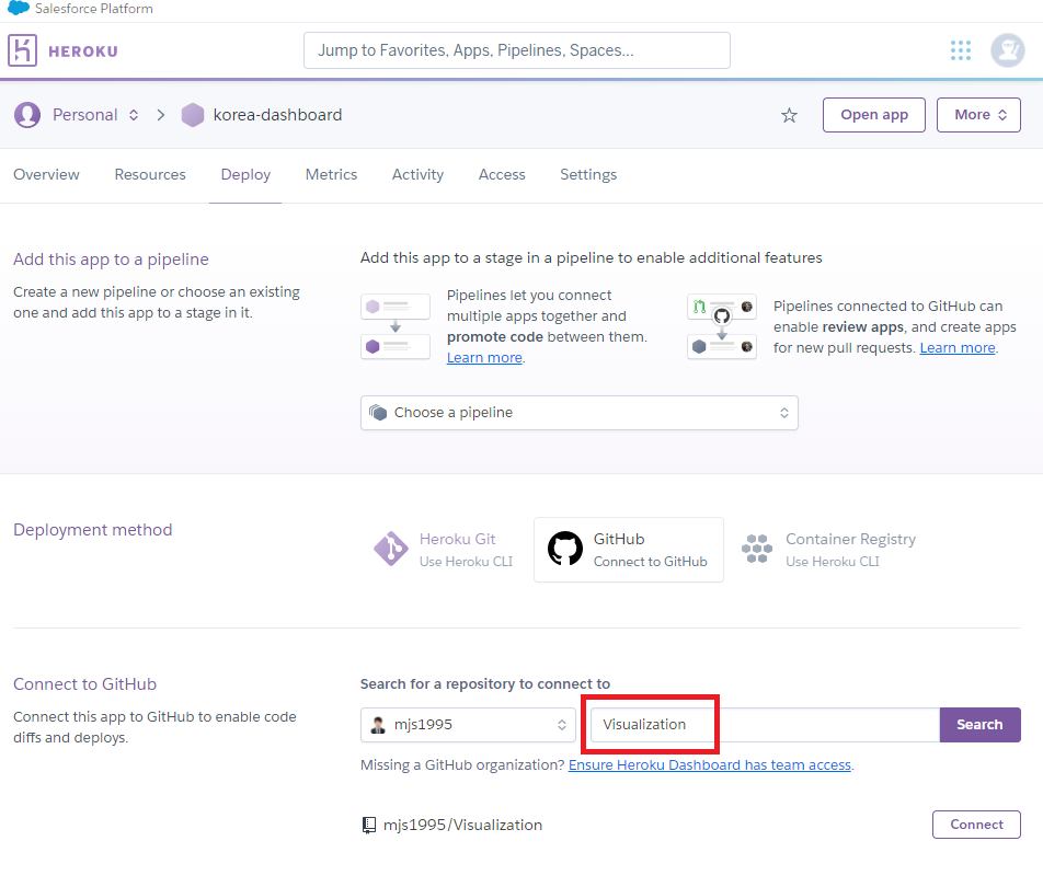
아래는 깃허브의 Repositories에서 구현시킬 dash가 있는 저장소를 찾아서 연결해줍니다.
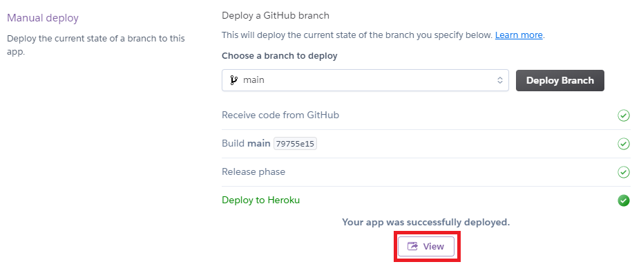
Deploy Branch를 눌러서 Heroku app을 만들어줍니다.
dash와 heroku를 이용하여 대시보드를 제작해봤습니다. plotly github에 가면 다양한 대시보드 예제들이 있습니다. 대부분의 경우 dash 콜백을 이용하여 대시보드를 구현하였는데 조금 더 공부를 하면 더 멋진 대시보드를 만들 수 있을 거 같습니다.
github.com/plotly/dash-sample-apps
plotly/dash-sample-apps
Apps hosted in the Dash Gallery. Contribute to plotly/dash-sample-apps development by creating an account on GitHub.
github.com
'BI > Python' 카테고리의 다른 글
| [python][pydeck] geopandas를 이용한 서울시 시각화 (1) (4) | 2021.07.06 |
|---|---|
| [python][QGIS] QGIS를 이용한 geojson 파일 만들기 (1) | 2021.06.18 |
| [python][plotly] 코로나 시각화 (0) | 2021.01.18 |
| [python][plotly] geojson을 이용한 지도그리기 (4) (0) | 2021.01.13 |
| [python][Mapbox] geojson을 이용한 지도그리기 (3) (12) | 2021.01.12 |